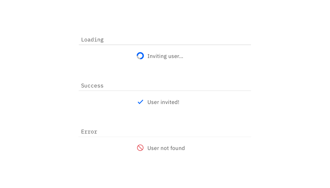
Inline loading
Color
| Class | Property | Color token |
|---|---|---|
.bx--loading__svg | stroke | $ui-03 |
.bx--inline-loading__checkmark | color | $interactive-01 |
.bx--inline-loading__text | color | $text-01 |
Typography
Button text should be set in sentence case, with only the first word in a phrase and any proper nouns capitalized.
| Class | Font-size (px/rem) | Font-weight | Type token |
|---|---|---|---|
.bx--inline-loading__text | 14 / 0.875 | Regular / 400 | $body-short-01 |
Structure
| Class | Property | px / rem | Spacing token |
|---|---|---|---|
| Spinner | width, height | 16 / 1 | – |
| Checkmark | width, height | 16 / 1 | – |


Structure measurements for small and large loading spinner | px / rem
Placement
The inline loading component should appear during any user action loading. If button is used to trigger the action, the inline loading component should replace that button.

Example of a inline loading in product context